design

Crepes in the City Airstream

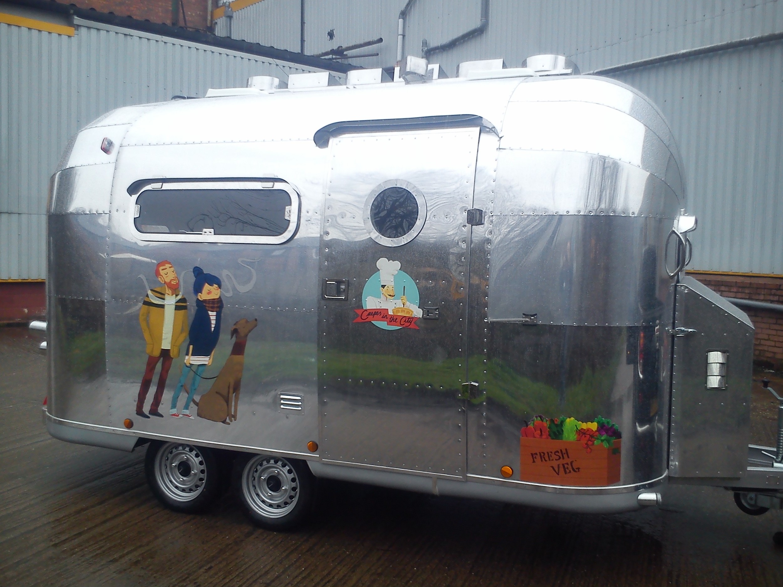
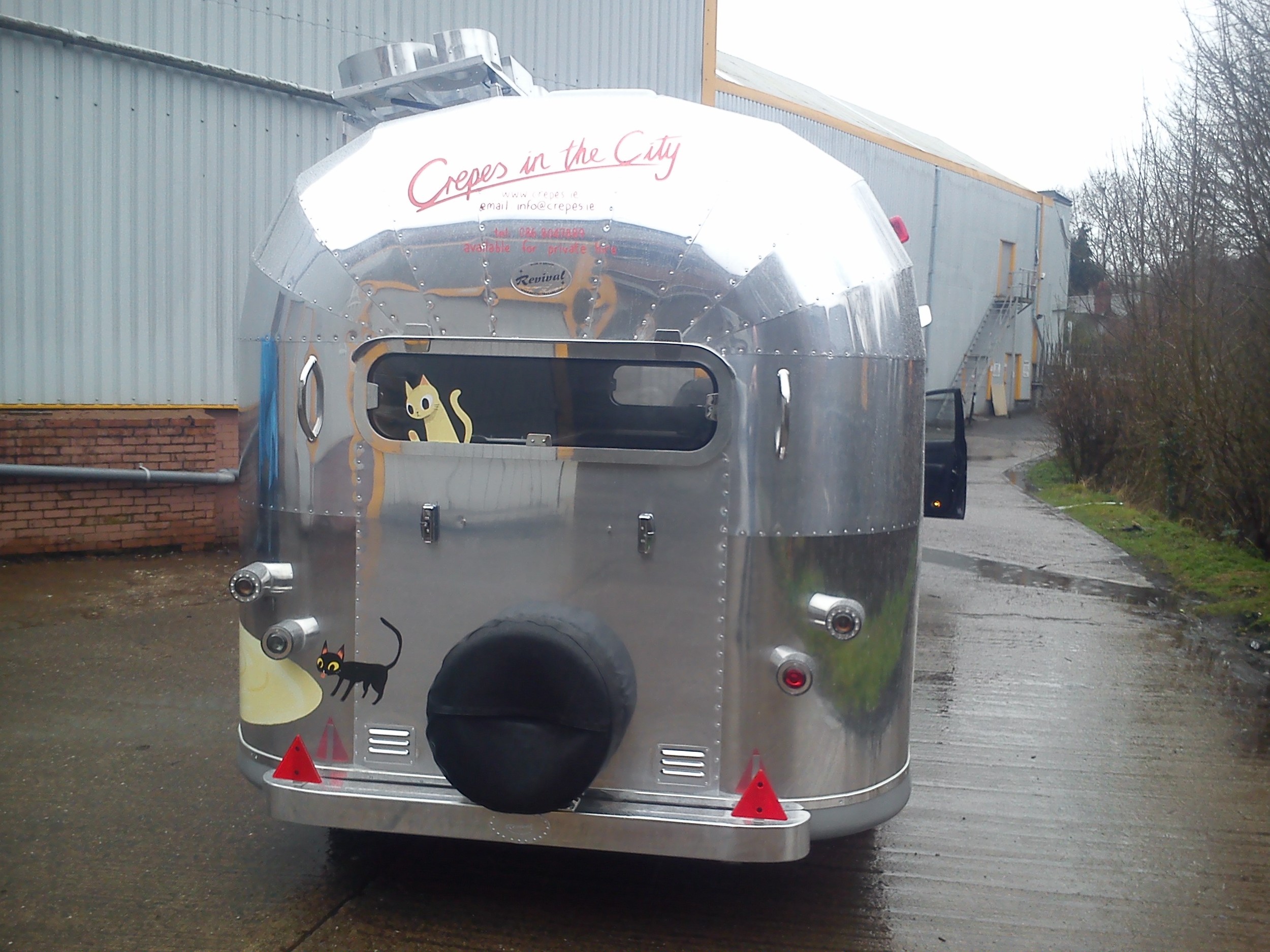
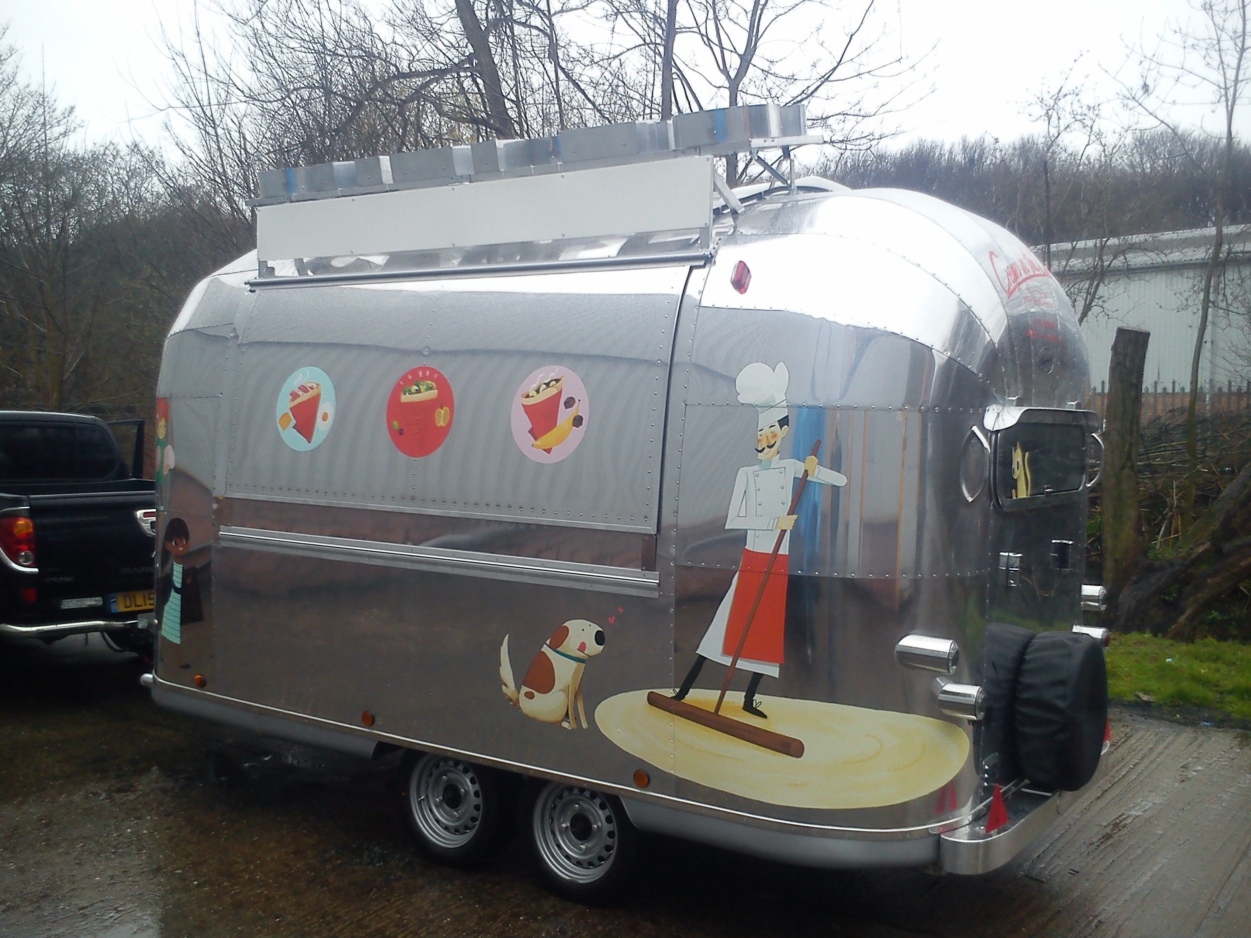
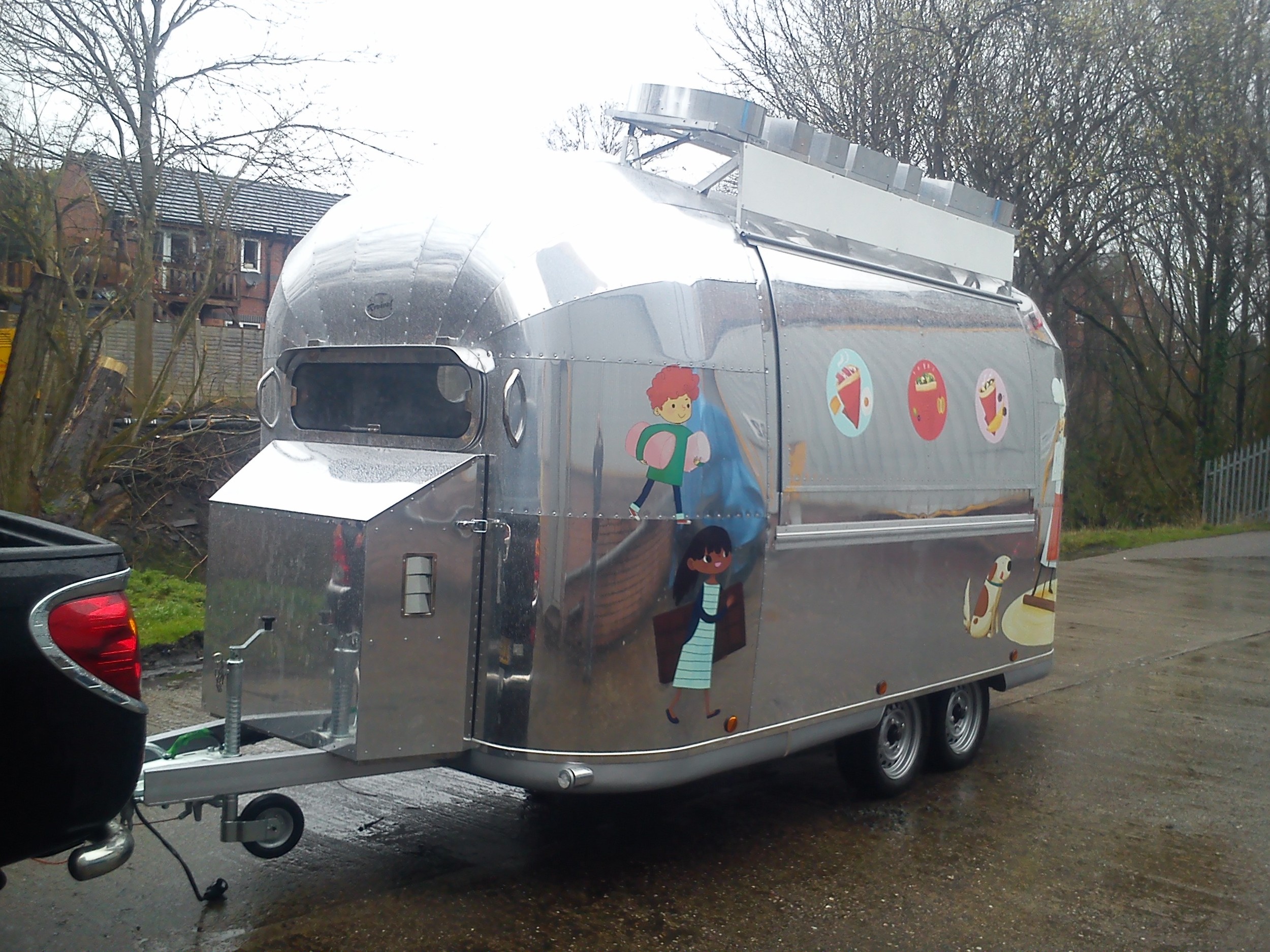
Last year I got asked by the lovely people at Crepes in the City to design decals for their new airstream food truck. If possible they wanted their chef mascot incorporated and something reminiscent of 1950s graphic design. 

It was my first time working on something to be printed on a 3d surface and on such a large scale. There was a lot to think about and a lot of measuring and fearing printing accidents but they came out exactly as hoped and the clients were happy. Hurray.

One personal feeling about the overall result was the images weren't as cohesive as one design overall in the end - just lots of spots as extra little requests were added on. Also I think in future I would work starting with the back because the illustrations I finished last turned out to be my favourite because by that time I'd worked out the style. 

This is what the truck looked like:

They also asked me to make the menu boards for all their trailers. Here's the ones I did especially for their trailer at Bloom.

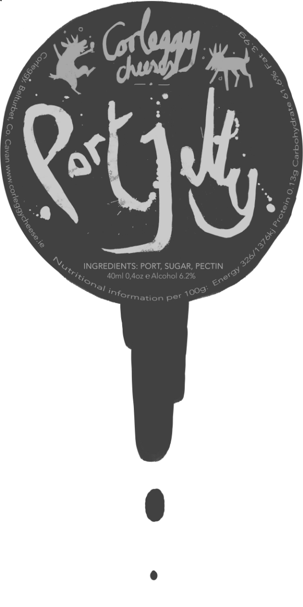
For some reason I felt compelled to hand write everything. I think it works better with the blackboard look I suppose. So the crepes trailers have had a little tidy-up and you should go check them out if you're around Dublin or any of the festivals they're operating at this summer!

Corleggy Cheeses Port Jelly

Recently I was asked by the lovely and wonderful people at Corleggy Cheeses to design a label for their port jelly jars. The labels got printed in time for the Christmas Craft Show at the RDS in Dublin where you can buy it this week and of course every weekend at Temple Bar Food Market. 

This was a fun project as I pretty much got to do what I wanted. I wrote the words with a Japanese brush pen, trying to make the letters look tipsy but still legible and then photographed with my phone and airdropped it to my iMac and had one of those moments when you acknowledge to yourself you live in the future where technology is magic. Here's a close up of the label before we moved the important text from the top to the side of the jar.

Aikido Kyoto Tenugui

Recently it was Yoko-sensei's 60th birthday and I got to design the commemorative tenugui for Aikido Kyoto. It's inspired by the choju giga scrolls which are very famous, and much loved in Kyoto. 

I didn't actually see it until the day of the seminar. It was a relief to see it came out pretty much as I designed it. All the members got one, and Yoko-sensei also sent some to all dojos we have a relationship so they've gone to Europe and America too. The remaining tenugui will be on sale for 1000 yen each. 

IMG_0893.JPG

OFFSET x SOUVENIR groundwork

 Hey. I had a busy year last year and didn't update this blog even once. I wasn't drawing a lot either to be honest except for posters and other quickly lashed out functional designs. I'm actually not sure about the longevity of this blog. I might end up moving somewhere else entirely... but for now here's some work I did for this event organised by Mr Steve McCarthy.

I can sort of indecisive at times.. so I ended up doing three different versions of the poster. These are two unused designs. I'll post the final poster on the day of the event.


ARC


Some guys who are moving into a new place today to live like real human adults. In naming this file I discovered their combined firstname initials spell ARC which seems almost unfairly cool. (or car if you prefer).

I enjoy the character-driven situational comedy suggested by the contrasting head shapes.Yay visual language! Media conditioning! \o/

I need to stop doing this kind of thing. Constantly posting doodles of people I know irl makes me feel like a wiener.